Author: Natasha Cantwell
Communications & Public Programming Officer
The 1979 Melbourne Landmark Competition was purely about ideas. Biographies, conceptual statements and background information were not required. In fact, in this contest run by the Victorian Government, any detail that might give away the entrant’s identity was strictly forbidden. The designs from world famous architects were in theory, supposed to sit alongside those from local school children, and each would be evaluated purely on face value, without bias.
This democratic judging process has left us with a collection of sketches, photographs and collages that contain a certain amount of mystery. Viewed together, the series provides an insight into the zeitgeist of the late seventies, but what if you want the backstory for a particular submission? For that, you may need to track down the designer.
I was very fortunate to find Jeffrey Heller, the creator of one of my favourite landmark entries, and to chat with him about the glass pyramid that could have become a Melbourne icon. The story begins in Piedmont, California, where an enthusiastic young architect is leafing through the pages of a popular architecture journal. Amongst the ads for computerised drafting systems and the latest innovations in phone booth design, an announcement for the Melbourne Landmark Competition catches his eye.
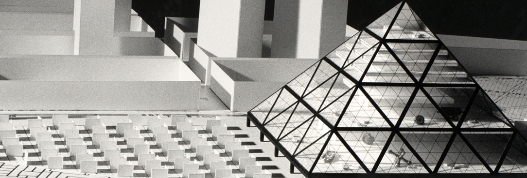
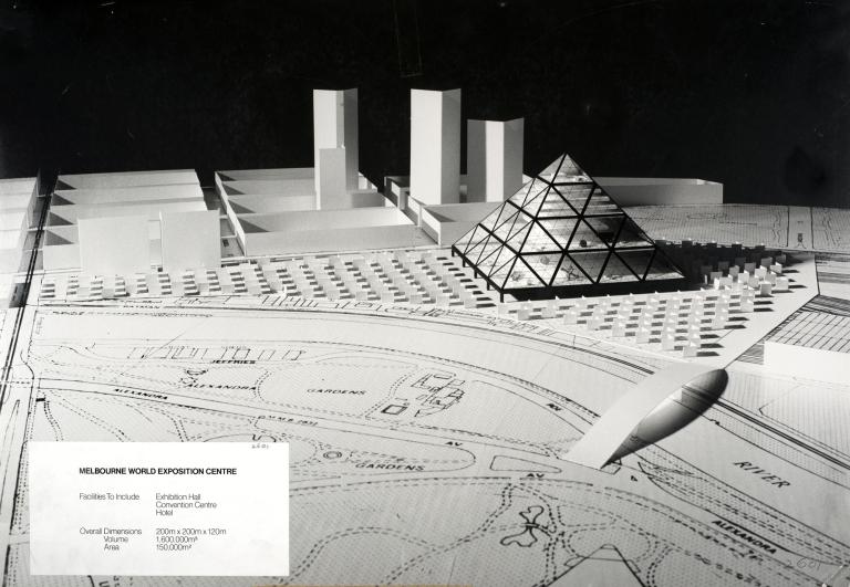
Jeffrey was struck by two important details within the brief notice: the endorsement of the State Premier and the huge scope for imagination and creativity. He was full of ideas and energy and could see it was a great opportunity, but what did he know about this city on the other side of the world? Creating a standout design would require an international eye but also insight into the local culture, climate and landscape. Luckily for Jeffrey, his fellow architect friend Richard Foster had recently worked in Melbourne, and it did not take too much convincing to get Richard on board. The deadline was tight, so they did not have any time to lose. Long days in the office working on various clients’ projects, were followed by late nights where the duo discussed how to create a landmark that would draw people into the heart of the city. They wanted multi-purpose, evolving spaces that could adapt and grow with the city’s changing needs and so their Melbourne World Exposition Centre design included a hotel, gallery space and convention centre, that would bring together locals and tourists.
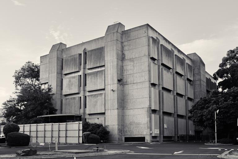
Recalling the initial brief 40 years later, Jeffrey vividly remembers the emphasis that was placed on the landmark becoming “famous throughout the world”. To achieve that, it needed to be instantly recognisable, and so a pyramid shape was chosen for their exposition centre. This simple but striking silhouette would be easily identifiable from all angles, resulting in the same iconic image, no matter where you viewed or photographed it from. It was also a timeless design, equally classical and contemporary. Jeffrey did not want their landmark to be time-stamped to the seventies and so deliberately worked against current trends. In 1979, Brutalism was dominating the architectural scene with its formidable geometric shapes rendered in exposed concrete and brick. The bold, avant-garde trend that had evolved in the 1940s and 1950s, by the 1970s had become the go-to style for government buildings in capitalist and communist countries alike. Brutalism’s beautiful ugliness has its dedicated fans, but Jeffrey is not one of them. He describes the cities of the 1970s as being full of “boring concrete spaces that no one wanted to be in.”
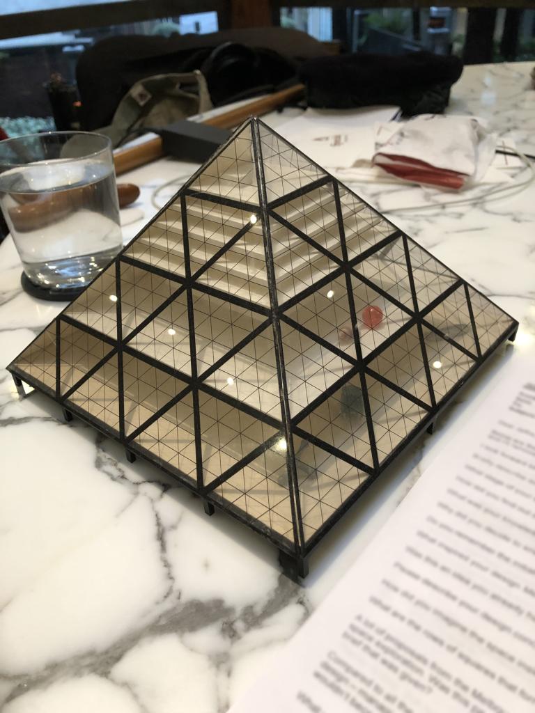
In contrast, the Melbourne World Exposition Centre would be light and airy, with three sides constructed from huge triangular windows. The west wall however, was a little different. Harnessing Richard’s knowledge of the city, this wall used very little glass, in order to moderate the effects of Melbourne’s harsh afternoon sun.
Pleased with their designs, the duo constructed a small but intricate model and photographed it against a simplified three-dimensional map of the city. They then mailed their entry to Australia and waited. Later that year Jeffrey received a letter from the Landmark Committee, congratulating him on being a winner! He was thrilled that the Melbourne World Exposition Centre was going to become a reality, but the bubble burst moments later when he read on to discover that there were in fact 47 other ‘winning’ entries. And while the $100, 000 prize money could easily be divvied up, choosing what was going to be built would be much more complicated. The letter stated that the Committee would have further discussions and the final design would combine different popular elements. During the following months Jeffrey expected to receive updates about how the final design was coming together but the communication had gone cold. When he finally inquired about the progress, the polite but uninformative response was that the project had been delayed. That was the last he officially heard from the Committee, but through the grapevine he found out that the Melbourne Landmark had been quietly quashed, and nothing was going to be built.
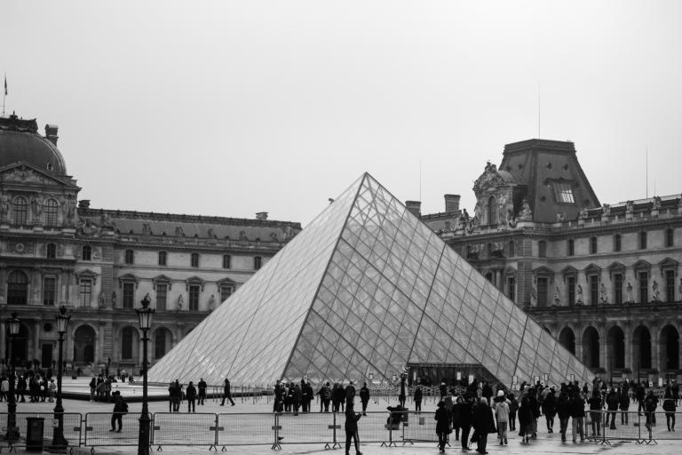
Then, a decade later, the glass pyramid saw the light of day in an unexpected way. In 1989, the world’s largest art museum, the Louvre, unveiled their new entranceway. I.M. Pei’s contemporary addition to the historic Paris monument bore a striking resemblance to the Melbourne World Exposition Centre. While some critics at the time attacked the modern design for being inconsistent with the classic French Renaissance style of the Palais du Louvre, the pyramid quickly became adopted by locals and tourists alike as a symbol of Paris in its own right. In fact, in a city filled with beautiful and ornate historic buildings, the contrasting pyramid helps to make the Louvre stand out. It is now easily identifiable, even to people who know little about history or architecture, which makes it a must-see (and must-selfie) spot on any whistlestop tour of Paris. It is this level of instant recognition which the Melbourne Landmark Committee were so desperately seeking. But while Melbourne missed out on claiming an international icon, Jeffrey does not harbour any resentment about how the competition turned out. He is still very proud of his early design and has kept the model for the past 40 years. He says he was happy to see the pyramid being built, even if it was through someone else’s design.
The Melbourne Landmark Competition submissions are part of Public Record Office Victoria’s collection. You can view the full list of entries here and view a selection of them below. Hover over the image and click on the arrows to scroll through the album, or click on the picture to view on Flickr.
Material in the Public Record Office Victoria archival collection contains words and descriptions that reflect attitudes and government policies at different times which may be insensitive and upsetting
Aboriginal and Torres Strait Islander Peoples should be aware the collection and website may contain images, voices and names of deceased persons.
PROV provides advice to researchers wishing to access, publish or re-use records about Aboriginal Peoples
