Transcript Episode 2: Monuments for the masses: The 1978 Melbourne Landmark Competition
Duration 26min
From the podcast series ‘Look history in the eye’
Written, produced and presented by Natasha Cantwell and Public Record Office Victoria
Music and sound design by Jack Palmer
Guests: Seamus O'Hanlon, Associate Professor of History at Monash University and Derham Groves, Senior Lecturer in Architecture at the University of Melbourne
Derham Groves
And they were sort of archived and buried as quickly as anything. And looking back, I mean, what an opportunity was lost.
And did they get any credit for it? Not at all. They got kicked from the minute it was suggested.
Natasha Cantwell
In this episode of ‘Look History in the Eye’ we uncover Melbourne’s controversial quest for a landmark in 1978. It’s a story of sabotage, snobbery, and design that was possibly too ahead of its time. How did an initiative that started with so much enthusiasm end up becoming the object of ridicule, and what happened to all those ideas and plans?
‘Look History in the Eye’ is produced by Public Record Office Victoria, the historic archive of the state government of Victoria. One hundred kilometres of public records about Victoria’s past are carefully preserved in climate-controlled vaults. We meet the people who dig into those boxes, look history in the eye, and bother to wonder ‘why?’
I’m Natasha Cantwell, Digital Communications & Public Programming Officer at Public Record Office Victoria, and one of my favourite collections that we hold here in the archives is the submissions from an open competition the Victorian Government launched 42 years ago, when they were looking for the kind of jaw-dropping landmark that would help to establish Melbourne’s position as a world-class city. The Melbourne Landmark Committee called for design proposals from everyone. It didn’t matter what country you lived in, whether you were a professional architect or a school child, they wanted to hear your most ambitious ideas. And they were offering the winner $100, 000, which was a lot of money in 1978. The promotional booklet that was sent out to applicants, name checked the Leaning Tower of Pisa, The Eiffel Tower, Disneyland, Egypt’s Pyramids, the Empire State Building and they suggested that “The great tourist attractions of the world aren’t always practical. Often they’re just glorious, nonsensical gestures.”1 And with that, the committee opened the floodgates and the glorious, nonsensical, and very 70s, gestures rolled in. It all sounds very exciting, a city embracing the future, a government saying ‘money is no object, we’re open to anything’, but the reality was that Melbourne was in the middle of a very dark time and politicians were desperate to pull us out of the slump.
Seamus O'Hanlon
The seventies, especially the second half of the seventies was really not a good time for cities across the western world. And there’s a whole bunch of reasons for this, but one of them is the oil crisis of 1973 -1974. And what that did was expose the high cost of production, manufacturing and production in the western world. And so what had been a boom time in many places in the early 1970s just basically stopped. The economy just essentially stopped, in a really short period of time. And so cities that had been very successful up until that time, such as Melbourne, in manufacturing, suddenly found themselves just lost. They didn’t know what to do with themselves and basically industries collapsed. They collapsed pretty much overnight.
Natasha Cantwell
That’s Seamus O'Hanlon, Associate Professor of History at Monash University and author of the books ‘City Life: The new urban Australia’, and ‘Federation Square Melbourne: The First Ten Years’.
Seamus O'Hanlon
When I think of the seventies, I think of rust, and Melbourne in the seventies was rusty and abandoned. Again, if you have a look at the shots of the docks, Melbourne’s docklands in the 1970s, there’s nothing there. It’s just empty. There’s one or two ships sitting there but they’ve gone, they’ve moved down. The trains were all run down. The tracks were run down. There was a lot of empty spaces throughout the CBD and Southbank. One of the things that happened in the mid-1970s was a really big property boom and it collapsed really rapidly in 1974 as part of the economic change I was talking to you about. And at that time what you would do when you bought a new property to redevelop – the first thing you do is basically flatten it, in preparation to build the shiny new, and they were all office towers that they were building at that time. And so there were whole spades of, especially in the west of the city but also up in the top end as well, where they’d been flattened, with plans to build these big sky scrapers and they weren’t built. And so, what to do with that land? Well one way to try and get some money out of it was to turn it into a car park, and so there were these street level car parks all across the centre of the city and Southbank and in other places. And they looked shocking. They looked really shocking. In the PROV collections, there are some wonderful photos of the central city from this period and seriously there are whole blocks which are just flattened. Those people who are interested in this stuff can take themselves off - if they’ve got money they can take themselves off to Detroit - but if you’re interested in looking at pictures, Detroit has the same sort of, to this day, there are whole blocks of Detroit that are simply not there. They’ve been flattened and they’re used as car parks or they’re abandoned. Melbourne looked a bit like Detroit in the mid to late 1970s.
Natasha Cantwell
And so local politicians were worried. They were looking to what was happening in cities overseas and they saw economic collapse, a huge rise in unemployment, rioting, increases in crime and they were scared that this was Melbourne’s future if we weren’t careful. So Rupert Hamer, Victoria’s Premier at the time, wanted to turn this situation around. Now that Melbourne’s CBD was no longer a hub of manufacturing, it needed something else to attract people to live, work and invest in the city. And so he wanted a landmark, something spectacular that the world couldn’t ignore, or at the very least, would stop us from being constantly overshadowed by Sydney.
Seamus O'Hanlon
The opera house opened in 1973, late 1973 on a site which was a former tram depot, sitting right on the harbour and it was spectacular and it looked spectacular. And for ten years, it was ten years overdue, well not ten years, but it was many, many years overdue. And for many years this had become kind of a joke, this place that was a folly and all this sort of stuff. Suddenly it was Australia. Most people’s image to this day of Australia is the Sydney Opera House and the Sydney Harbour Bridge. And what that meant is that Melbourne, which had been in some ways equal to Sydney, or it’s equal and had been a really powerful economic place, the home of manufacturing, the home of major banks etc, until that time, was suddenly, not only lost its industries but actually had lost its purpose. And so Sydney’s landmark was one of a number of landmarks that were built around the world in the late 60s, early 1970s but in many ways it became a model. So finding some way of branding yourself, having an image of yourself became really important for cities in the 1970s and 1980s, and again today. You know we’re seeing this in a lot of places now, the architectural landmarks. There’s a term we use now called ‘Starchitect’. You bring in some international famous architect to design a building for you and that becomes you, that becomes who you are. And so in a world of branding, in a world of marketing, having something that says ‘you’ in one easy image is really important. And Melbourne didn’t have one. And so they wanted one.
Natasha Cantwell
And Rupert Hamer had the perfect spot in mind for where the landmark was to go – the Jolimont Railway yards that stretched out eastwards from Flinders Street station. In what was clearly prime CBD, river-front land there stood this huge series of train tracks and stabling yards for parking all of Melbourne’s trains.
Seamus O'Hanlon
It was an eye sore. There’s no question it was an eye sore. It was also Melbourne’s front door. You know, if you think about it, the grand entrance to Melbourne from the south, crosses the river, which was really polluted and rundown and dirty itself, and then crosses these railway tracks, and then gets into this rather glamorous Flinders Street Station and then up to Swanston Street. And so it was like well yeah, there’s a problem here. The entrance to your city should be ceremonial and should look smart but that’s costly, so it wasn’t done.
Natasha Cantwell
Politicians had actually been trying to do something about this problem site since 1925. So many times in fact that according to The Age, ex-Premier Denis Napthine called it "the black hole of Melbourne.”2 Today Federation Square covers just over about half of the yards, but when the landmark competition was launched, the only major buildings on the site were the Princes Gate Towers, twin office blocks built in 1967 in the International Style. And these brown boxy modernist towers, which were then only 11 years old, were actually part of the reason why the site was chosen. Far from enhancing the Jolimont yards, the general consensus was, that they’d made it even more of an eyesore.
Derham Groves
These were two sort of 17 or 18 story building, right on the river. And it was what you saw from the entry to the city, down St Kilda Rd, from the south, so all of the kind of posh suburbs like Toorak and Malvern, and East Malvern and all of those sorts of suburbs – travelling from those, the rich part of Melbourne, into the city – before 1967 you saw quite a picturesque sort of skyline, but after these two building were built, they were like a fence that actually blocked the skyline. And as soon as they went up, people realised that, you know, a big mistake had been made and they became the sort of seen to be the ugliest buildings in Melbourne etc.
Natasha Cantwell
That’s Derham Groves, Senior Lecturer in Architecture at the University of Melbourne and author of numerous books on architecture and popular culture.
Derham Groves
The competition was announced in December of 1978. About that time I was a student, so I was about a third or a forth year architecture student at the time. I remember quite clearly how kind of ridiculed the competition was.
Natasha Cantwell
It’s interesting that when Derham thinks back to the competition, the first thing that comes to mind is how it was ridiculed, because this competition was hugely popular. Melbourne was clearly in dire need of rejuvenation and locals were keen for this site, this gateway into the city, to be transformed. Over 2300 people took up the opportunity to present their ideas to the panel. So where was this animosity coming from? Well, it turns out that the campaign against the competition was happening from within the judging panel itself. One of the key judges, art critic Patrick McCaughey, who went on to become the Director of the National Gallery of Victoria two years later, had, not surprisingly, a rather highbrow view of design. He was quoted in the newspapers at the time as saying that the submissions “give banality a new dimension and demonstrate a megalomania that makes the pyramids look like pimples”.3 And McCaughey also publically attacked his fellow judges for not sharing his views. He was furious that, in his words, they “steadfastly refused to acknowledge the poor quality of the contest ideas.”4 Then, in a deliberate attempt to sabotage the competition, he wrote a protest piece in The Age, directly mocking a number of the entries and describing the competition as “the theatre of the grotesque”.5 Recalling this incident in his memoirs, 24 years later, McCaughey was still proud of the outrage his article had caused amongst all those involved, and he wrote “I enjoyed creating the stink”.6 Well, his spiteful comments were certainly devoid of tact but could he have had a valid point? Had the organisers made a mistake by making it an open competition? On one hand they seemed to think that the untrained eye would dream up magical, unrestrained concepts, unburdened by boring practical concerns, but on the other hand, they wanted something to rival the architectural genius of the Empire State Building and the Sydney Opera House. Surely, when you open up the submission process to school children and enthusiastic amateurs, you must expect applicants whose idea of a landmark leans more towards the Sunshine Coast’s Big Pineapple than the Sydney Opera House. It shouldn’t have been a surprise that many applicants were simply having fun with their ideas or referencing what was happening in pop culture at the time.
Derham Groves
So for example in 1978 Close Encounters of the Third Kind came out, so there are several entries to do with spaceships, UFOs, and so you can sort of see the popular culture of the time being reflected in these entries, which I think are just fascinating. One entry was actually sort of suggesting that this was a place where close encounters of the third kind could occur. Those sorts of things I think are remarkable for another reason. Now of course you can understand why judges of the competition would look down their noses at such things but in retrospect I think it’s a great kind of, you know, snapshot of where the culture was at that particular time and so these sorts of entries are remarkable I think.
Natasha Cantwell
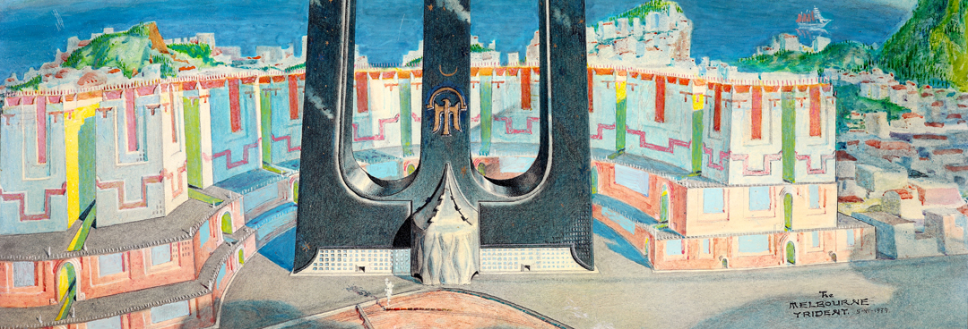
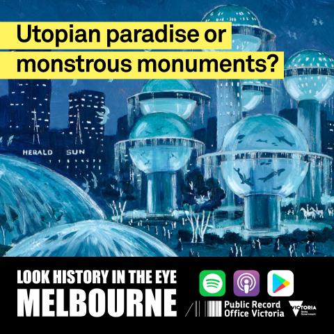
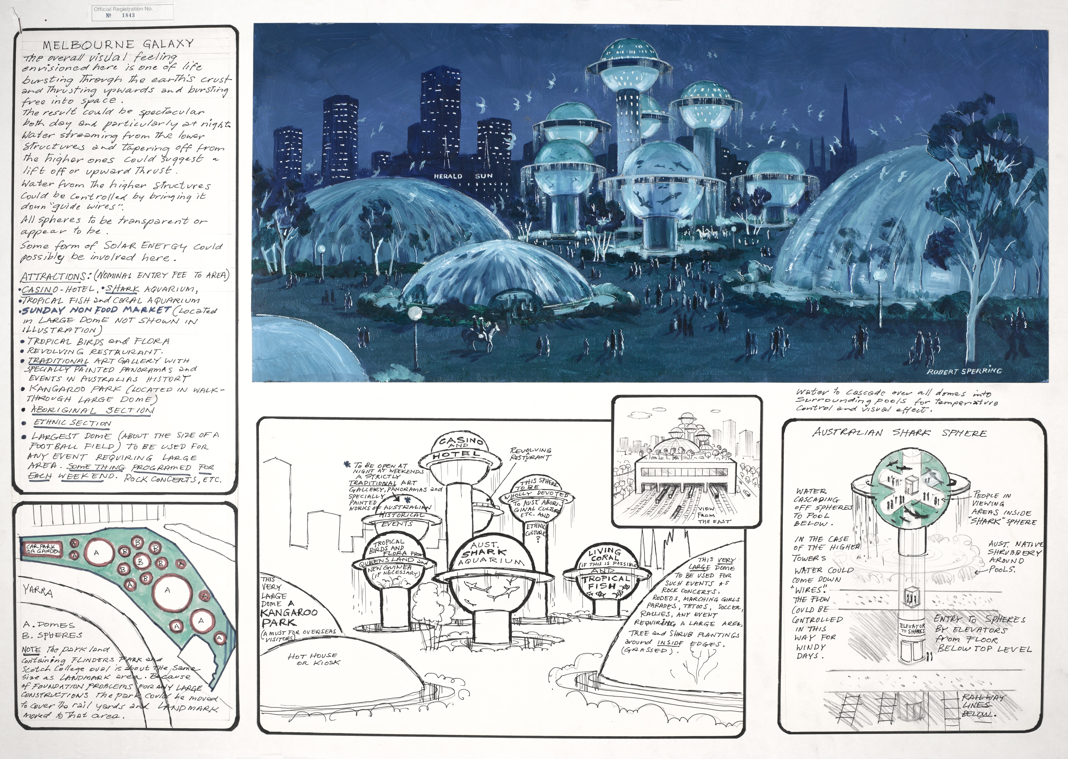
I should point out here that when Derham says there are ‘several’ entries to do with spaceships, that’s a bit of an understatement. There were so many structures that look like spaceships and plenty of drawings which wouldn’t be too out of place on the cover of a Philip K Dick novel. Many are very beautiful, like Robert Sperring and Sydney Davidson’s ‘Melbourne Galaxy’, with its series of enormous domes and planet-like-spheres, filled with sharks and tropical fish. Their illustration shows a night-time scene with an other-worldly sense of serenity. The drawings are certainly enticing, although I can imagine, if it had been built, this sci-fi utopia may have looked embarrassingly kitsch by the time the mid 80s rolled around. But did the judges really only receive these populist type entries? McCaughey made it sound like there were no serious entries, no viable contenders whatsoever.
Derham Groves
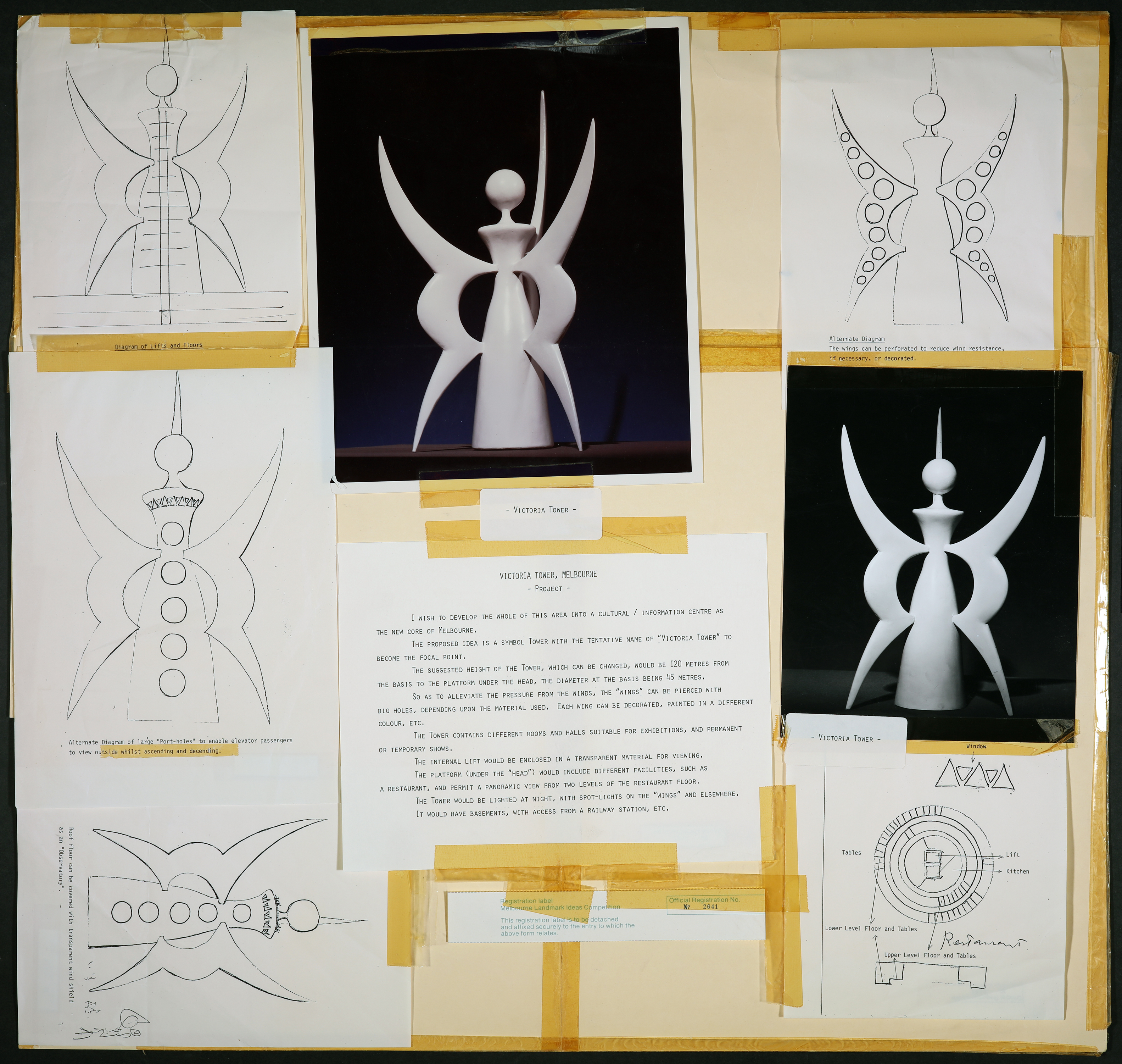
What surprised me was the number of architects that had put entries in and many of them were, you know, top notch, world class, star architects, like Cedric Price, Aldo Rossi, you know Will Alsop, the Super Studio, the Italian Super Studio, the Studio Natalini, who designed Olivetti typewriters for example. You know, there were many. And many artists as well - Tarō Okamoto, the Japanese sculptor - he put in an entry and he did a little maquette, it looked like an angel actually. And if you saw that entry you’d say, well you know, ‘so what’ sort of thing. This is the thing, if you didn’t know what that person was then capable of developing it into, of course you’d reject it. But if you knew that, you know, Okamoto was the guy who did the Tower of the Sun at the 1970 Expo and you looked at that and looked inside that and thought goodness me, this is what this guy can do and this is virtually what he’s sort of suggesting for the landmark competition, of course you would have given him a guernsey, of course you would have said, can you develop this to the next stage so we can see what this is like, so you know many, many entries were like that I think.
Natasha Cantwell
And it isn’t actually that surprising that these entries by famous artists and industry professionals were slipping through the cracks. According to McCaughey’s memoir, the whole judging process was more than a little haphazard and amateurish. He criticised the committee’s lack of research, documentation, and a proper judging brief. Apparently the panel only met a handful of times and not everyone attended. So while he’s making bold claims about the submissions being, in his words “so staggeringly awful that the exercise turned into higher hilarity”7 it also seems rather implausible that all 2300 entries were fully examined and considered. Entrants also only had one A1 piece of cardboard to get their idea across with, which favoured bold, obvious ideas, over more subtle, elaborate concepts. And, in order to ensure a level playing field, entrant’s names were withheld from the judges.
Derham Groves
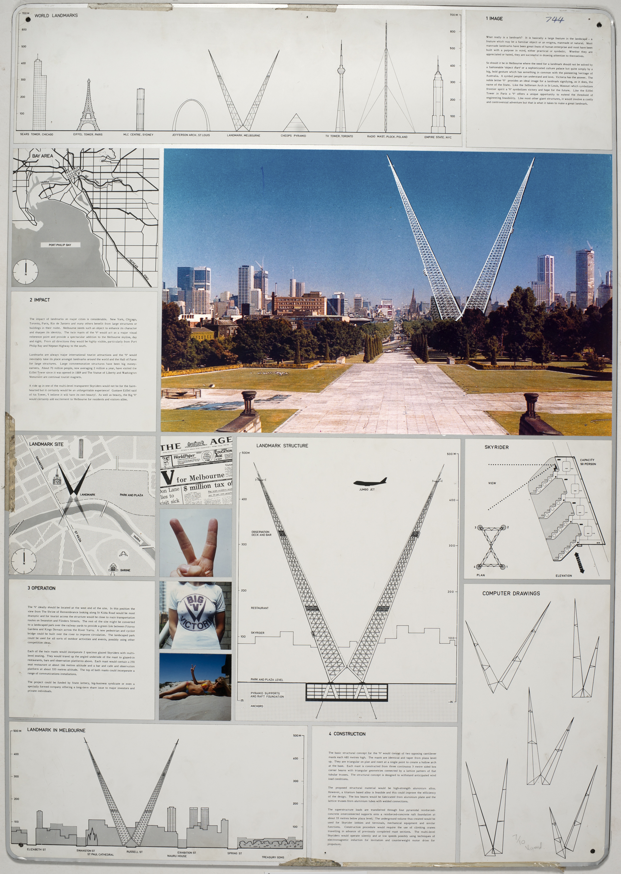
On one level of course it’s ok that all of the entries were blind, nobody knew who had done the entries and you can sort of think, well ok, that was a very democratic competition, anybody could enter and so that’s appropriate. But I think, in the end that also sort of killed it because lots of these people were capable of really developing these schemes into, you know, amazing things and they didn’t even make it to the 48. And sometimes the judges just simply got it wrong. There was one done by Jan Kaplický and David Nixon and Jan Kaplický for example went on and did that extraordinary media centre, above, that sort of hovers above Lord’s Cricket Ground. You know, incredible. And David Nixon went on to design the Space Station, you know, so, these are incredible guys getting together to do this. And they did a huge, gigantic ‘V’ for Victoria and they actually got, were one of the 48 and one of the judges, Patrick McCaughey was absolutely outraged that it made the cut because he interpreted this big ‘V’ as the two finger salute. But I mean I’ve spoken to David Nixon about that entry and it was the furthest thing from their mind. That was a serious thing that they did. They got in Frank Newby the very talented British engineer, to look at it etc. So the judges were getting it wrong at all levels, clearly, it seems to me.
Natasha Cantwell
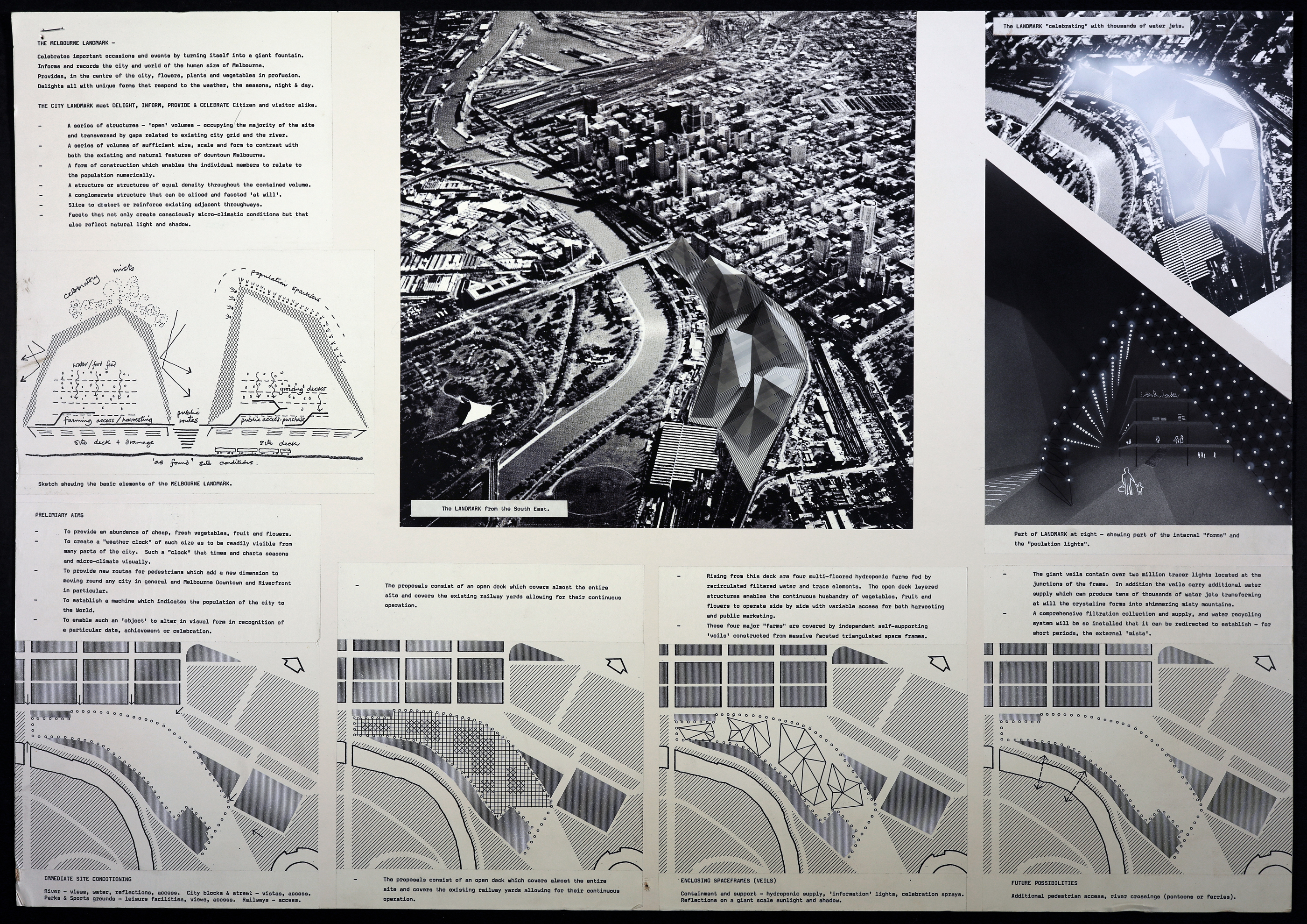
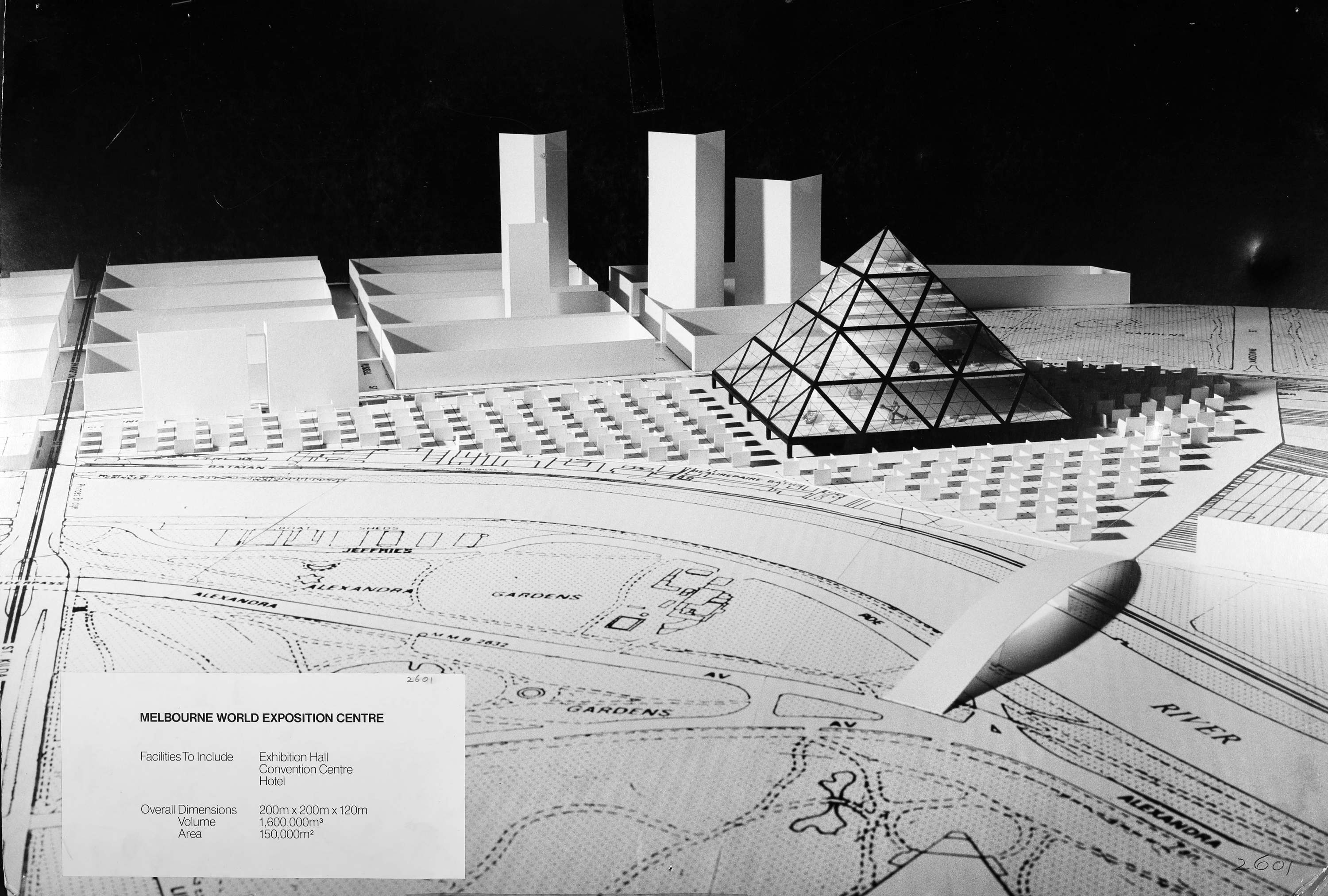
And we’ve only mentioned a few of the noted architects, artists and designers who put ideas forward. There were many, many more. Derham has spent a lot of time studying the entries and he’s adamant that the collection is full of world-class ideas that Melbourne could have been proud of. His favourite entry is from Cedric Price, who utilised an enormous amount of cutting edge technology from the time. Price’s design included a hydroponic urban farm, a digital display population clock and a cloud generator that would periodically cover the area in a fog. There’s also ideas that went on to have proven success in other cities. Jeffrey Heller and Richard Foster’s entry ‘Melbourne World Exposition Centre’ for example - it looks pretty much exactly like IM Pei’s iconic glass pyramid at the Louvre, which was commissioned in 1984, that’s five years after the Melbourne Landmark Competition. This timeless design, which manages to be both classical and contemporary, was good enough for Paris, a city already jam-packed with landmarks, but apparently, not good enough for Melbourne?
Derham Groves
So this notion that all of the entries were sort of jokey, useless, of a low quality etc, it’s just not true. I mean there’s some extraordinary things suggested and if Melbourne had had its act together we could have not just had one but we could have had many of these sorts of things or at least we could have had this sort of discussion about what we could have or what Melbourne could have been like.
Natasha Cantwell
But there was no development stage, or public discussions, or any further consideration given to the ideas. Instead the judging panel concluded that there wasn’t a single outstanding idea, or even a “small group of entries which might be exclusively used in combination.”8 Instead the $100, 000 prize money was split between 48 finalists and the committee recommended combining some of the popular ideas. Their final report didn’t include any sketches from the submissions, visual descriptions or specific ideas. They wrote:
“A number of concepts emerged as ones to which many ideas related, and which would be popular as basic design concepts. These include gardens, towers, fauna and flora exhibitions, pleasure centres, entertainment and sporting complexes, convention centres, casinos, inner urban living area, transport systems, a transport link terminal and car parking.”9
So, there you have it, 2300 ideas from all over the world, some by the leading architects and artists of the day, and the judges boiled it down to a list of really generic and obvious ideas. In Committee Chairman, Ronald Walker’s letter to Hamer, he writes, “Upon the release of this report to the public there will be some who will say “it cannot be done”, well Premier, we believe it can be done.”10 Walker’s pre-emptive plea to the Premier to not file the report in the ‘too hard basket’ sadly didn’t work, but for anyone reading the committee’s recommendations with contemporary eyes, it all sounds very achievable. So achievable in fact, that since 1979, Melbourne has implemented all of those ideas in some form, at various locations across the central city. But considering that they originally specified that the scope was limitless and that ideas shouldn’t be held back by costs, constructability or even compliance with regulations, where were the outrageous ideas, so unique and memorable that they could hold their own against the Leaning Tower of Pisa and Disneyland? The committee suggested that a further competition could be held to come up with a more solid plan. But with such a lacklustre list of recommendations, it isn’t surprising that Hamer didn’t take up the offer to drag out proceedings any further. Instead, the 48 awards were handed out, the paperwork filed away and the project abandoned.
Derham Groves
I can’t remember any kind of big debate or discussion in the architecture profession about, you know, all of these ideas that were generated. Nothing came of them. I don’t think they were ever discussed. Really, looking at the archive now, it’s a snapshot of what people, both in the profession and ordinary people, thought that architecture was headed into the future. So it was a remarkable opportunity missed, I think.
Natasha Cantwell
An opportunity missed, indeed, but don’t take our word for it, dig into the collection yourself. Just go to Public Record Office Victoria’s website and type into the search bar: Landmark Competition Drawings. Then you can make up your own mind about whether they’re just a bunch of cringe-worthy concepts, or whether maybe you can find something truly special in there that could have been Melbourne’s iconic landmark.
1. Program for the Melbourne Landmark Ideas Competition. Melbourne Landmark Committee, December 1978, p.5. Retrieved from https://www.cca.qc.ca/en/search/details/collection/object/449708
2. Lucas, Clay. 'Black hole of Melbourne' likely to swallow another vision for Jolimont rail yards The Age, 1 September 2014. Retrieved from https://www.theage.com.au/national/victoria/black-hole-of-melbourne-likely-to-swallow-another-vision-for-jolimont-rail-yards-20140901-10b09w.html
3, 4. Professor says landmark-contest entries 'banal' The Canberra Times, 18 December 1979, p. 3. Retrieved from https://trove.nla.gov.au/newspaper/article/110974177
5 - 7. McCaughey, Patrick. The Bright Shapes and the True Names: A Memoir. Melbourne: The Text Publishing Company, 2003, p. 168
8 - 10. Walker, Ronald. Landmark Competition Report. Melbourne Landmark Committee, December 1979.
